This is another post of mine in English. I’ve decided to post it so I could explain how do I use network diagram as a tool for political elections results analysis. It would be in English, because I want to explain it to non-Lithuanian speaking audience.
Main parts of network diagram is a node and an edge. Actually multiple nodes and edges. Nodes are the objects, which are usually being analyzed on the network diagram and edges are the connectors of these nodes. A network diagram should have at least two nodes and at least one edge. The simplest network diagram looks like that:

This is all that I think I should know about the network diagram’s basic elements. These elements has quantitative values: edges may have weight, nodes can be quantified by amount and weight of edges.
The most useful things, which network diagrams brings to my election analysis, are algorithms, which would use quantifiers of these nodes and edges in order to place them in respective to each other. Sounds a bit complicated, but it gets easier with use cases.
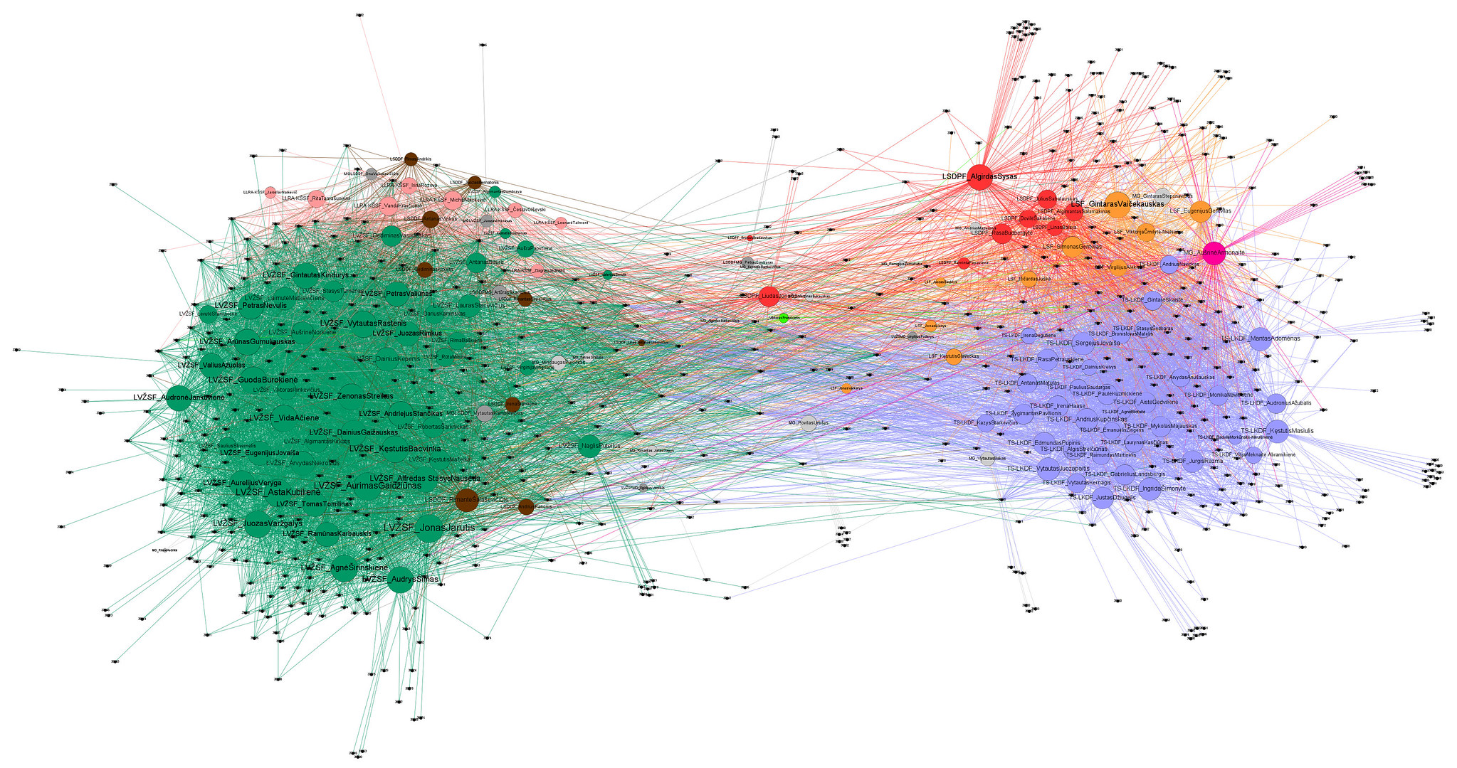
This is one of my network diagrams, which I have generated with Gephi, which we may use for further explanations:

This is first round president elections result in Vilnius (capital). Looks kind of messy, but also kind of a beautiful. Right? Dark blue (or blue-ish) nodes are candidates and other nodes are constituencies. Edges are the amount of votes from each constituency, which candidate received. The magic is “Force Atlas 2” algorithm. It works in such a way, that nodes are pulled together by these edges – as stronger as more edges and as more weight edges has. And as more edges with more weight node has – as stronger it pushes other nodes from it self. Algorithm would put these forces on the nodes and lets them move so they would end up in the equilibrium. If you’d take a look closer:

You’d see that “A. Kojelavičiaus” constituency has one edge to “Valentinas MAZURONIS” and to “Valdermar TOMAŠEVSKI”. These two nodes has a particular weight:
| source | Weight | Target |
| 653246_A. Kojelavičiaus | 106 | Valdemar TOMAŠEVSKI |
| 653246_A. Kojelavičiaus | 5 | Valentinas MAZURONIS |
__
This is the part of the data, from which this diagram have been generated. And weight are the votes. 5 votes from this constituency were sent to Mr. Valentinas and 106 votes went to Mr. Valdemar. BTW, these digits in the name of the source node are just ID’s as sometimes we have same name for different constituencies.
I’m not really sure what more technical data or technical explanation would be still requiring for these network diagrams of mine. I guess, if someone would care enough – one would put a comment under that post and ask any question.
I’ll better proceed with the diagram analysis part. In such network diagrams, which nodes were placed by this “force atlas 2” algorithm relative place of each node is meaningful:
- as closer node is to a center of whole diagram – as more edges it has with all other nodes (and weights are distributed more equal): see candidates Saulius SKVERNELIS, Gitanas NAUSĖDA, Ingrida ŠIMONYTĖ;
- as more on the edges or outside of the diagram node is – as less edges with less weight it has with other nodes: see Naglis PUTEIKIS, Valentinas MAZURONIS and others;
- as closer constituencies are to each other – as more votes from these constituencies went to the same candidates;
- as closer candidates are to each other as more they do tend to share votes on the same constituencies;
- … any other observation could be true.
I was making that diagram in order to understand which constituencies we may want to focus on on the second round, when Ingrida and Gitanas won the first one. It can also help us to understand what kind of a message we may bring to each and every constituency looking at what candidates these constituencies were voting for. Which voters would tend to migrate from which candidate to which. Would they go to second round.
I also forgot to mention the color code: as more red they are – as bigger they are – as more votes were given in these constituencies. As yellow-ish as blue-ish they are – as less voters were there.
It could be also be worth mentioning, that we may compare each pairs of candidates on the excel, but this network diagram gives us a better overview and relations in any pairs or triples or… of candidates.
I do also use these network diagrams in any results analysis, where ratings are being involved:
Parliament elections 2020 results analysis
Parliament members votes in Parliament sessions results analysis
Our internal party rating results analysis
Please do not hesitate to put a comment if you have any.
